Your public site
New visitors won’t go looking for your program — put it where they already are:- Homepage banner — a short strip or section announcing the program, linking to the program page or straight to the enrollment link.
- A dedicated program page — the place every other channel can link to, and the one spot that explains the program properly.
- Footer link — cheap, permanent visibility on every page.
- Order confirmation page — if you sell online, the post-purchase moment is ideal: the customer just demonstrated they’re coming back.
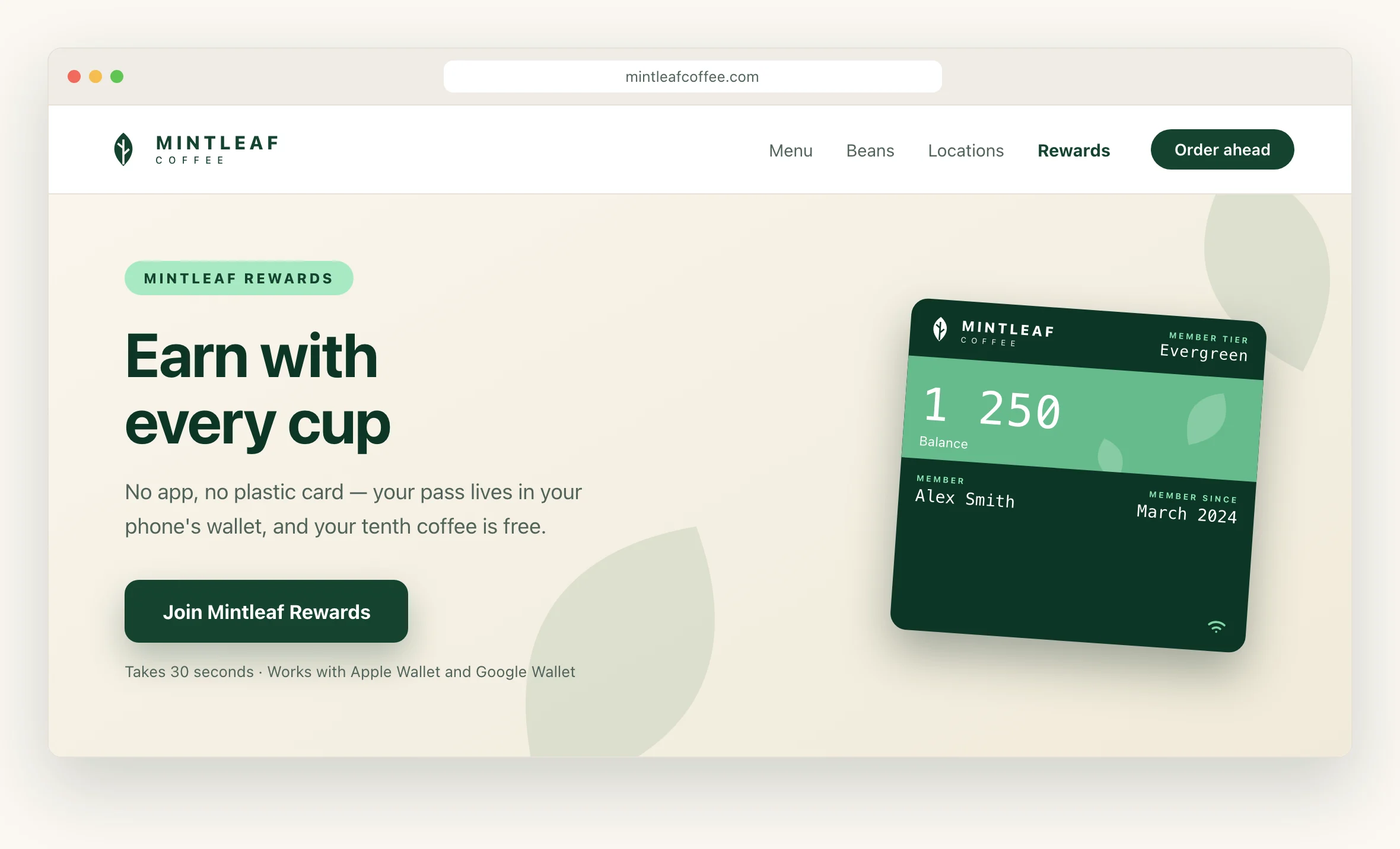
Earn with every cup Mintleaf Rewards lives in your phone’s wallet — no app, no plastic card. Every coffee counts automatically when you tap to pay, and your tenth is free.One headline, the benefit, three steps, one button to the enrollment link. A short FAQ below it (no app needed, works on iPhone and Android, what happens with my details) catches the hesitant.[ Join Mintleaf Rewards ] Questions? It works with Apple Wallet and Google Wallet, and there’s nothing to install.
- Join — 30 seconds, right from your phone
- Tap to pay like you always do — your pass counts each visit
- Enjoy your free tenth coffee
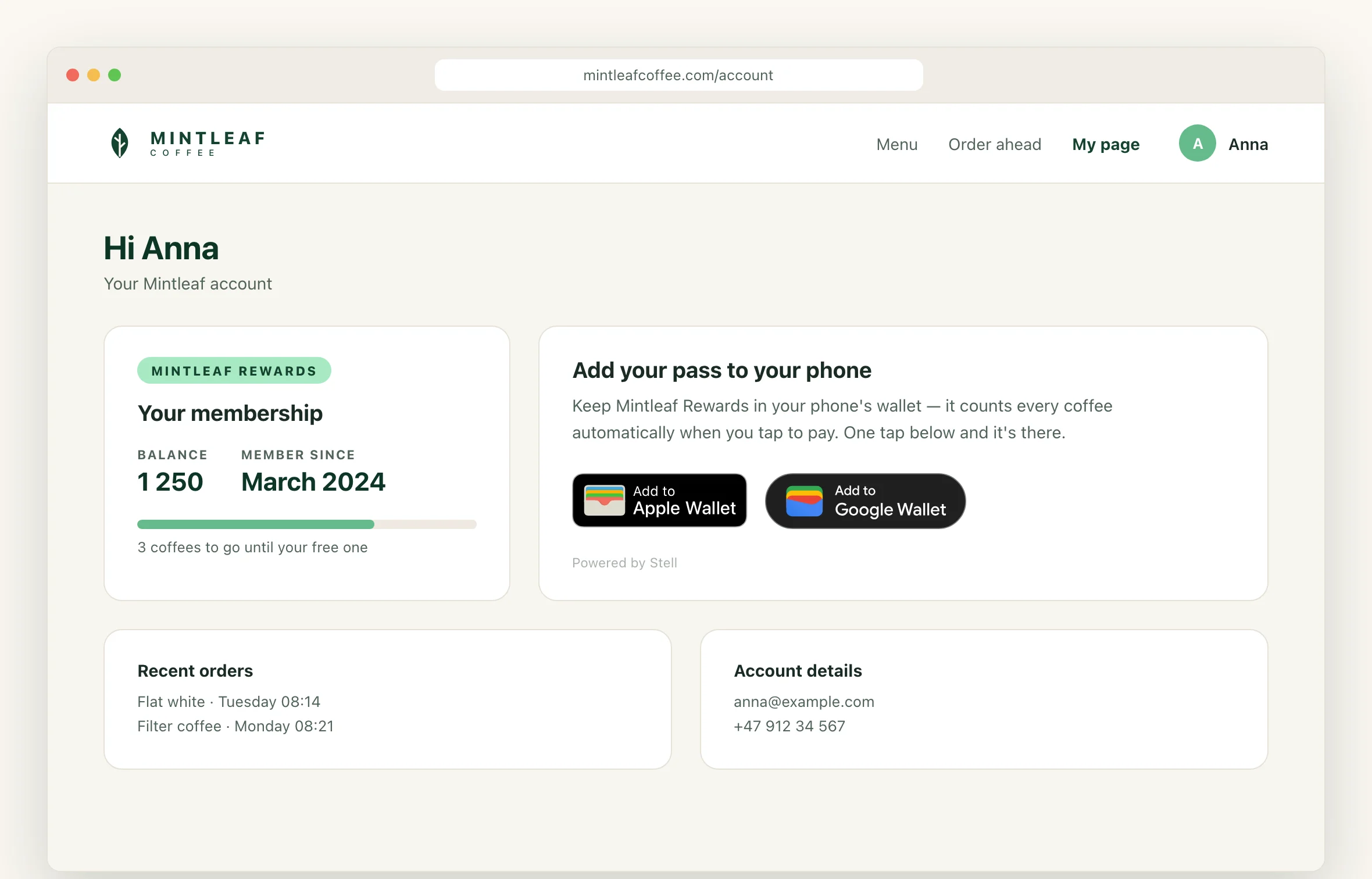
My page: one tap for signed-in members
The signed-in member page is the best home for the wallet button widget. The member is identified, so the widget issues their pass on a single tap — no form, no typing, no drop-off. Setup, options, and the embed snippet are all on the widget page; what’s left is placement:- Account dashboard — the first thing a member sees after signing in.
- A “my benefits” or “my membership” section — where members already look for perks.
- Post-purchase page — they’re signed in, they just bought something, and the pass would have counted it.
Which entry point where
| Visitor | What to give them |
|---|---|
| Anonymous visitor on your public site | The enrollment link (banner, program page, footer) |
| Signed-in member on my page | The wallet button widget — one tap, no form |
| Email recipient | The email wallet links — see email |