
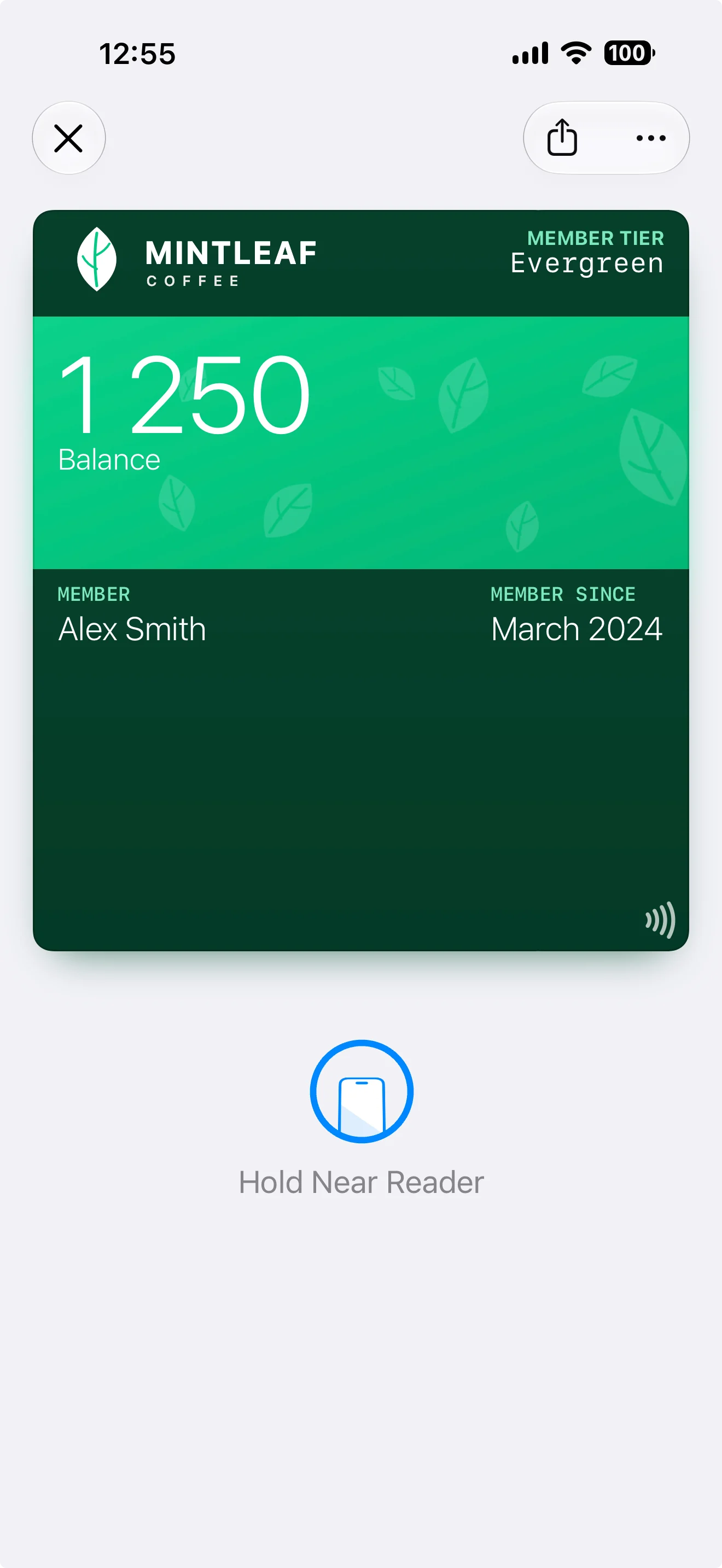
The front of the pass
From top to bottom:| Area | What goes there |
|---|---|
| Logo and logo text | Top-left corner: your logo (and optionally a short logo text next to it). This is your brand anchor — it’s the first thing a customer recognizes |
| Header fields | Top-right corner, opposite the logo. Always visible — even when the pass is stacked with other passes in the wallet — so use them for the single most useful value, like a points balance |
| Strip or background image | The visual heart of the pass. Depending on the pass style, this is a strip image (a banner across the upper part) or a full background image |
| Primary field | The pass’s headline value, rendered large — for example the member’s name or balance. On styles with a strip image, the primary field sits on top of it |
| Secondary and auxiliary fields | Rows of smaller values in the middle of the pass — member since, tier, store, and so on. How many fit and how they’re arranged depends on the pass style (see the per-style layouts below) |
| Barcode or NFC | The bottom of the pass: the scannable barcode, or for tap-to-use programs the NFC capability (shown with a small tap icon). See barcodes and NFC |
The back of the pass
Customers reach the back through the ⋯ button when the pass is open in their wallet. Back fields hold everything that doesn’t belong on the front: terms, contact details, longer descriptions, links. There’s much more room here, and text can be longer.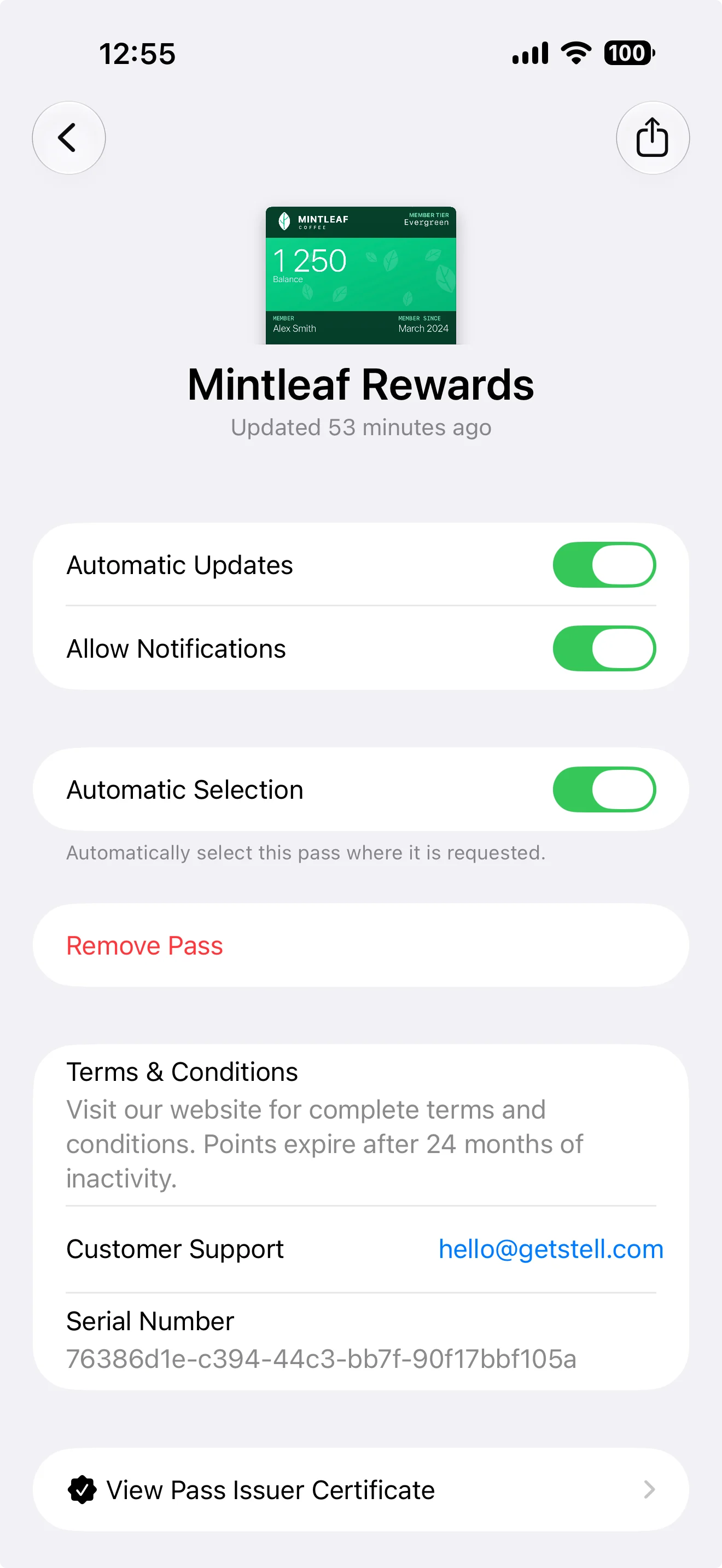
| Wallet control | What it does |
|---|---|
| Automatic Updates | Lets the pass receive changes from your program — new field values and design updates. If a customer turns this off, their pass keeps its old content until they turn it back on |
| Allow Notifications | Whether this pass may show notifications on the customer’s lock screen, including the messages you send to it. Turned off, the pass still updates — just silently |
| Show on Lock Screen | Whether the pass may surface on the lock screen when the customer is near one of its locations. This toggle only appears when the pass template has locations set |
| Automatic Selection | Lets the iPhone present this pass automatically where it’s requested — for tap-to-use programs, this is what brings up the right pass at the Terminal without the customer hunting for it |
| Remove Pass | Deletes the pass from this device |
The editor also offers footer fields. These only appear on the generic poster layout, as a final line at the very bottom of the pass — on other layouts, keep your content in the areas above.
Pass styles
The pass style (chosen in the Settings tab) decides the overall layout — most importantly whether the pass uses a strip image or a full background:
| Style | Visual base | Typical use |
|---|---|---|
| Store Card | Strip image | Loyalty and membership cards — the most common choice |
| Coupon | Strip image | Offers and vouchers |
| Generic | Background image — or the poster layout with full-bleed artwork on the newest iPhones | Anything that doesn’t fit the other styles |
| Event Ticket | Strip image, or a full-poster layout with its own artwork on newer iPhones | Events and entry passes |
| Boarding Pass | Background image | Travel — also allows 5 secondary/auxiliary fields instead of 4 |
Layout by style
Each style arranges the same areas differently. The two poster variants are the new, modern pass presentations: full-bleed artwork carries the design, and they activate automatically on newer iPhones when your template has poster artwork.- Store Card & Coupon
- Generic
- Generic Poster
- Event Ticket
- Poster Event Ticket
- Boarding Pass


How this knowledge maps to the editor
- The wallet draws the pass; you supply the ingredients. You can’t move the areas around — you decide what goes in each area.
- Less is more: passes are glanced at, not read. A strong image, one primary value, and a couple of supporting fields beat a crowded layout.
- Field values can be dynamic — showing each customer their own name, balance, or tier. See fields and dynamic content.
Want to go deeper? Apple’s developer documentation covers the underlying pass format in technical detail — see Wallet Passes on the Apple Developer site. You won’t need it to use the editor; everything merchant-relevant is covered in these pages.